
Building a simple accordion with accessibility in mind

Stuart Harland
05 October 2024
Accordions are a handy way to keep your content organised and easy to navigate, making it easier for users to scan a page and easily find what they’re looking for.
You’ve probably seen them everywhere - FAQs, feature lists, you name it. They’re awesome because they let you group related info in expandable sections, which not only improves the user experience but also keeps your page from feeling cluttered or overwhelming (think about cognitive burden!)
So, they’re definitely something to have in your user interface (UI) tool-box.
Beyond the usual CSS, HTML, and JavaScript, there’s one thing you really need to keep in mind: accessibility. An accordion isn’t truly great unless everyone can use it, including users who rely on screen readers or keyboard navigation.
In this article, I’ll go through the process of creating a simple reusable, accessible accordion component that you can easily integrate into your projects.
So, why use an accordion?
Check out some of the benefits of adding an accordion to your pages:
- Super at space-saving: Adding an accordion can offer a nice compact presentation of information, which is really useful for content-heavy pages.
- Enhanced user experience: Your users can expand the sections they’re interested in and skip the rest, which reduces cognitive load and makes the content easier to digest.
- Improved accessibility: A well-made accordion can provide additional keyboard navigation to a page and also greater screen reader support, making your content more accessible to a wider audience.
Just a quick note: if information is important and essential for users, don’t tuck it away—make sure it’s front and center where everyone can easily find it.
So with all this in mind, let’s get into it…
A step-by-step guide
Step 1: Structure our HTML
To make an accessible accordion, let’s start by structuring the HTML.
Here’s the basic structure I use:
<div class="accordion">
  <!-- item 1 -->
  <div class="accordion-item">
    <button id="accordion-btn-001" aria-controls="accordion-panel-001" class="accordion-button" aria-expanded="false">
      Accordion Item 1
    </button>
    <div id="accordion-panel-001" aria-labelledby="accordion-btn-001" class="accordion-panel">
      <p>Content for the first accordion item goes here.</p>
    </div>
  </div>
  <!-- item 2 -->
  <div class="accordion-item">
    <button id="accordion-btn-002" aria-controls="accordion-panel-002" class="accordion-button" aria-expanded="false">
      Accordion Item 2
    </button>
    <div id="accordion-panel-002" aria-labelledby="accordion-btn-002" class="accordion-panel">
      <p>Content for the second accordion item goes here.</p>
    </div>
  </div>
</div>
The anatomy of our accordion
A single accordion is a <div> with the class .accordion. Easy! Inside, we can have as many .accordion-items as we need, each having its own button and content panel. In the HTML above, I’ve added two items for demo.
The button element
Each accordion item starts with a <button> that acts as the label, title, and trigger to toggle the visibility of the related content. Each button has an aria-expanded="false" attribute, to tell screen readers that the content it triggers is currently hidden. This will change to true when the content is made visible (handled by the the JavaScript we will write soon.)
The aria-controls attribute connects the button to its corresponding content panel, allowing screen readers to identify which section of content will be displayed.
The content panel
Below each button, we have a <div> containing the actual content. This will be hidden by default using the CSS styles we’ll be adding in the next step.
Each panel also has an aria-labelledby attribute that links it back to the button, letting screen readers know which button controls it.
Have a look over the relationship between the button’s id and aria-controls, and the div panel’s id and aria-labelledby.
Step 2: Adding CSS for the look and feel
Using CSS, we can style up the basic look and feel of the button and set the accordion panels to be hidden by default.
Here’s a simple setup:
.accordion {
display: flex;
flex-direction: column;
gap: 0.938rem;
.accordion-item {
border: 2px solid #363636;
}
.accordion-button {
display: flex;
flex-direction: row;
justify-content: space-between;
align-items: center;
gap: 0.938rem;
padding: 0.938rem;
color: #363636;
cursor: pointer;
background-color: #fdf7ed;
border: none;
transition: background-color 0.3s;
&:hover,
&:focus {
background-color: #f7e4d9;
}
&.is-active {
background-color: #c7e0e5;
}
}
.accordion-panel {
padding: 0.938rem;
}
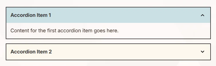
}So the outcome of this, should look like this image below, but experiment with the colours and styling to give it your own look and feel 🖌️
So, in the example image, we have the accordion and our two items. The content panels are open at the moment, but we’ll add in some further CSS into the .accordion-panel CSS class to hide these until the button is triggered.
See the CSS additions below, and add these to your .accordion-panel class.
.accordion-panel {
padding: 0.938rem;
/* add the display attribute below */
display: none;
/* add the 'is-open' state modifier */
&.is-open {
display: block;
}
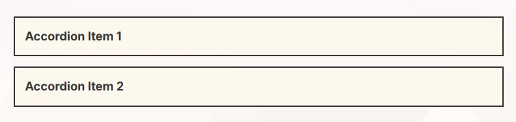
}With these added, the accordion content panels should be hidden, leaving only the buttons on display:
Step 3: Adding JavaScript for the interactivity
Using JavaScript, we can toggle the active state of the button, the open state of the panel, and also change the aria-expanded attribute of the clicked button.
Again, the aria-expanded attribute will provide more information about what is happening to assistive technologies such as screen readers.
Here’s the basic JavaScript script we’re going to use:
// attach a single event listener to each accordion component block
document.querySelectorAll('.accordion').forEach((accordion) => {
  accordion.addEventListener('click', (event) => {
    const btn = event.target.closest('.accordion-button')

    if (!btn) return // if not on a button, do nothing

    const panel = btn.nextElementSibling // get the panel next to the button
    const isPanelOpen = btn.classList.contains('is-active') // set the panel to have the class 'is-active'

    // if this panel is already open, then call a closePanel, and exit the event
    if (isPanelOpen) {
      closePanel(btn, panel)
      return
    }

    // open the panel
    openPanel(btn, panel)
  })
})

// close the panel
function closePanel(button, panel) {
  button.classList.remove('is-active')
  button.setAttribute('aria-expanded', 'false')
  panel.classList.remove('is-open')
}

// open the panel
function openPanel(button, panel) {
  button.classList.add('is-active') // set the button to be active
  button.setAttribute('aria-expanded', 'true') // set the aria-expanded to true
  panel.classList.add('is-open') // set the panel to be open
}
The JavaScript uses a single event listener on the accordion container rather than on each button individually, because it’s often more efficient and simplifies the code.
We could add an event listener to every button in the accordions, but attaching to each button creates a separate function in memory. For a small number of buttons, this might not be noticeable, but if you have a page full of accordions or huge dynamically generated accordions, the overhead could add up.
Alright, let’s break the JavaScript down! Here’s what’s happening piece by piece:
1. Find all the accordions on the page (we could have more than one)
First, we’re grabbing all the elements with the class .accordion on the page. Our page could have multiple FAQ sections that each open when clicked, so we’ll handle them all. We’re using forEach to loop through each one, to give each accordion its own listener.
document.querySelectorAll('.accordion').forEach((accordion) => {
  // code inside here runs for each accordion
})
2. Listen for clicks
For each accordion, we add an event listener for the click event. So, whenever a user clicks anywhere inside an accordion, this bit of code will run.
accordion.addEventListener('click', (event) => {
  // code here happens when we click inside an accordion
})
3. Check if a button was clicked
Inside our event, using event.target.closest('.accordion-button') finds the closest button within the clicked area, and our code checks if the click happened on, or inside, our button element. If it didn’t, the code stops running.
const btn = event.target.closest('.accordion-button')
if (!btn) return // if not on a button, do nothing
4. Find the panel and check if it’s already open
Now, we need access to the panel associated with the button that was clicked.
Here’s the handy part…the panel sits right next to the button in the HTML, so, we can use btn.nextElementSibling to see if we can find it.
Then we check if the button already has an “active” class (is-active). If it does, it means the button was previous clicked, and the content panel is open, so we need to check for this as we’ll want to let users close panels as well.
const panel = btn.nextElementSibling // get the panel next to the button
const isPanelOpen = btn.classList.contains('is-active')
5. Close or Open the panel
If the panel is already open, we call a helper function closePanel and stop executing further code (using return).
If the panel is not open, we call a helper function openPanel to make it appear.
if (isPanelOpen) {
  closePanel(btn, panel)
  return
}

openPanel(btn, panel)
6. The helper functions: closePanel and openPanel
Let’s break down these helper functions. They do exactly as their names suggest: they open and close the accordion panels. This is handled by adding or removing the CSS classes, and also changing the aria-expanded attributes.
closePanel
button.classList.remove('is-active'): This removes the CSS class that makes the button “active.”button.setAttribute('aria-expanded', 'false'): This sets an attribute for accessibility so screen readers know it’s closed.panel.classList.remove('is-open'): This removes the open CSS class from the related panel, making it hidden.
function closePanel(button, panel) {
  button.classList.remove('is-active')
  button.setAttribute('aria-expanded', 'false')
  panel.classList.remove('is-open')
}
openPanel
button.classList.add('is-active'): This adds the “active” CSS class to style the button as active - our CSS will make this a nice blue background.button.setAttribute('aria-expanded', 'true'): This adds an attribute for screen readers indicating the button and associated panel is expanded or collapsed.panel.classList.add('is-open'): This adds a CSS class to display the panel (it setsdisplay: block;in our CSS).
function openPanel(button, panel) {
  button.classList.add('is-active') // make the button active
  button.setAttribute('aria-expanded', 'true') // screen readers know it's open
  panel.classList.add('is-open') // shows the panel
}
And that’s it!
In short, this JavaScript lets each accordion expand or collapse when each button is clicked. It keeps things simple by checking if a panel is already open or closed, and it makes the page more accessible with some friendly attributes for screen readers.
Step 4: Accessibility Best Practices
We’ve already added these, but remember - to make our accordion as accessible as possible, we can check this step to ensure we have implemented these best practices:
- Use
aria-expanded: When we use this attribute on the<button>we can let screen readers know if the content is expanded or collapsed. - Keyboard Navigation: By using standard
<button>elements, we help users who prefer to navigate with keyboard. Users will be able to tab through each item in our accordion, and pressEnterorSpaceto expand or collapse the related panel. - Focus States: Using CSS styles we can ensure the accordion buttons have visible focus indicators to improve accessibility for keyboard users.
Step 5: Customisation
Customisation Option 1: Expandable as Single or Multi items
We can amend our JavaScript to allow only one item to open at a time (ideal for FAQs) or multiple items.
To only allow one section to open at a time, modify the JavaScript:
// attach a single event listener to each accordion component block
document.querySelectorAll('.accordion').forEach((accordion) => {
  // check the type of accordion
  const IsSingleItemOnly = accordion.hasAttribute('data-single')

  accordion.addEventListener('click', (event) => {
    const btn = event.target.closest('.accordion-button')

    if (!btn) return // if not on a button, do nothing

    const panel = btn.nextElementSibling // get the panel next to the button
    const isPanelOpen = btn.classList.contains('is-active') // set the panel to have the class 'is-active'

    if (isPanelOpen) {
      closePanel(btn, panel)
      return
    }

    if (IsSingleItemOnly) {
      closeAllPanels(accordion)
    }

    openPanel(btn, panel)
  })
})

// close all panels within a specific accordion
function closeAllPanels(accordion) {
  accordion.querySelectorAll('.accordion-button.is-active').forEach((btn) => {
    const panel = btn.nextElementSibling
    closePanel(btn, panel)
  })
}

// close a specific panel
function closePanel(button, panel) {
  button.classList.remove('is-active')
  button.setAttribute('aria-expanded', 'false')
  if (panel) {
    panel.style.maxHeight = null
    panel.classList.remove('is-open')
  }
}

// open a specific panel
function openPanel(button, panel) {
  button.classList.add('is-active')
  button.setAttribute('aria-expanded', 'true')
  if (panel) {
    panel.classList.add('is-open')
  }
}
Let’s jump into the updated functionality with the new IsSingleItemOnly flag and closeAllPanels function.
New check: IsSingleItemOnly flag
const IsSingleItemOnly = accordion.hasAttribute('data-single')This line checks if a data-single attribute is present on each accordion. When data-single is present, IsSingleItemOnly will be true; otherwise, it’s false. This means that if data-single is on the accordion, only one panel can be open at a time.
Now, when we click to open a new panel, this bit of code fires:
if (IsSingleItemOnly) {
  closeAllPanels(accordion)
}
If IsSingleItemOnly is true, then before a new panel is opened, we call the closeAllPanels function. This ensures that any already open panels are closed first, ensuring we have only one panel open at a time.
New function: closeAllPanels
function closeAllPanels(accordion) {
  accordion.querySelectorAll('.accordion-button.is-active').forEach((btn) => {
    const panel = btn.nextElementSibling
    closePanel(btn, panel)
  })
}
The closeAllPanels function does just this! It goes through each active (open) button and panel within the current accordion and handles them all using our closePanel function.
Summary of the new JavaScript
- If
data-singleis a data attribute on the accordion, the JavaScript will setIsSingleItemOnlyistrue, meaning only one panel can be open at a time. - In a set-up like this, when you click a new button,
closeAllPanelscloses any open panels in that accordion before opening the new one.
This update makes your accordion more versatile, by allowing multiple panels to stay open or restricting it to just one open panel at a time based on the data-single attribute.
Customisation Option 2: Add a custom icon
We can add an icon as an additional visual cue. This could be an up/down arrow, or plus/minus symbols that switch based on whether the panel is expanded.
First, let’s amend our HTML to prepare for the new icon in the button. Because we have set our button style to use flex and justify-content: space-between;, our button will be ready for an icon. We’ll add a span, and set it to use aria-hidden.
Here, we’re use aria-hidden="true" on an element, we’re telling screen readers to basically pretend the element doesn’t exist. It becomes invisible to assistive technologies.
In this case, applying it to the with the icon means the screen reader will disregard it. This is extremely handy for icons that don’t add meaningful information, but are just there as a nice visual cue.
<button id="accordion-btn-001" aria-controls="accordion-panel-001" class="accordion-button" aria-expanded="false">
  Accordion Item 1
  <!-- this is the new span -->
  <span aria-hidden="true" class="icon-arrow"></span>
</button>
Now, we’ll amend our CSS and add the icon styling into the .accordion-button class. Take note of the icon styles, and the additional icon style being handled in the .is-active class of the button.
.accordion-button {
  display: flex;
  flex-direction: row;
  justify-content: space-between;
  align-items: center;
  width: 100%;
  gap: 0.938rem;
  padding: 0.938rem;
  color: #363636;
  cursor: pointer;
  background-color: #fdf7ed;
  border: none;
  transition: background-color 0.3s;

  /* styling for the icon */
  .icon-arrow {
    display: block;
    height: 24px;
    width: 24px;
    background-position: center;
    background-size: contain;
    background-image: url('data:image/svg+xml,<svg height="48" viewBox="0 0 48 48" width="48" xmlns="http://www.w3.org/2000/svg"><path d="M14.83 16.42l9.17 9.17 9.17-9.17 2.83 2.83-12 12-12-12z"/><path d="M0-.75h48v48h-48z" fill="none"/></svg>');
    transition: rotate 0.3s;
  }

  &:hover,
  &:focus {
    background-color: #f7e4d9;
  }

  &.is-active {
    background-color: #c7e0e5;

    /* change for the icon when the button is active */
    .icon-arrow {
      rotate: 180deg;
    }
  }
}
So, the icon-arrow element will be a little icon on the right side of the accordion button. Here’s what each part of the CSS is doing:
display: block;: This makes sure the icon span takes up its own space as a block element.heightandwidth: This sets the icon’s size to24pxby24px, keeping it nice and square.background-image: This loads an SVG image directly from adata URL. This icon is an arrow / chevron that will rotate based on the button’s state. This could be any image, or could even be an icon font instead.background-positionandbackground-size: As we’re using an image, these settings ensure the SVG image stays centered and scales nicely within the24pxsquare.transition: rotate 0.3s;: Finally, this allows an animation to the rotation change.
In a nutshell, .icon-arrow by default is an arrow pointing down, and when .is-active is added to the button, it rotates 180 degrees to point up. Nice!
Full code example
Finally, here’s the combined HTML, CSS, and JavaScript, showing our simple accessible accordion component that users can easily browser and navigate:
HTML
<!-- data-single is set, so only one item will open at a time -->
<div data-single class="accordion">
  <!-- item 1 -->
  <div class="accordion-item">
    <button id="accordion-btn-001" aria-controls="accordion-panel-001" class="accordion-button" aria-expanded="false">
      Accordion Item 1
      <span aria-hidden="true" class="icon-arrow"></span>
    </button>
    <div id="accordion-panel-001" aria-labelledby="accordion-btn-001" class="accordion-panel">
      <p>Content for the first accordion item goes here.</p>
    </div>
  </div>
  <!-- item 2 -->
  <div class="accordion-item">
    <button id="accordion-btn-002" aria-controls="accordion-panel-002" class="accordion-button" aria-expanded="false">
      Accordion Item 2
      <span aria-hidden="true" class="icon-arrow"></span>
    </button>
    <div id="accordion-panel-002" aria-labelledby="accordion-btn-002" class="accordion-panel">
      <p>Content for the second accordion item goes here.</p>
    </div>
  </div>
</div>
CSS
.accordion {
  display: flex;
  flex-direction: column;
  gap: 0.938rem;

  .accordion-item {
    border: 2px solid #363636;
  }

  .accordion-button {
    display: flex;
    flex-direction: row;
    justify-content: space-between;
    align-items: center;
    width: 100%;
    gap: 0.938rem;
    padding: 0.938rem;
    color: #363636;
    cursor: pointer;
    background-color: #fdf7ed;
    border: none;
    transition: background-color 0.3s;

    .icon-arrow {
      display: block;
      height: 24px;
      width: 24px;
      background-position: center;
      background-size: contain;
      background-image: url('data:image/svg+xml,<svg height="48" viewBox="0 0 48 48" width="48" xmlns="http://www.w3.org/2000/svg"><path d="M14.83 16.42l9.17 9.17 9.17-9.17 2.83 2.83-12 12-12-12z"/><path d="M0-.75h48v48h-48z" fill="none"/></svg>');
      transition: rotate 0.3s;
    }

    &:hover,
    &:focus {
      background-color: #f7e4d9;
    }

    &.is-active {
      background-color: #c7e0e5;

      .icon-arrow {
        rotate: 180deg;
      }
    }
  }

  .accordion-panel {
    padding: 0.938rem;
    display: none;

    &.is-open {
      display: block;
    }
  }
}
JavaScript
// attach a single event listener to each accordion component block
document.querySelectorAll('.accordion').forEach((accordion) => {
  // check the type of accordion
  const IsSingleItemOnly = accordion.hasAttribute('data-single')

  accordion.addEventListener('click', (event) => {
    const btn = event.target.closest('.accordion-button')

    if (!btn) return // if not on a button, do nothing

    const panel = btn.nextElementSibling // get the panel next to the button
    const isPanelOpen = btn.classList.contains('is-active') // set the panel to have the class 'is-active'

    if (isPanelOpen) {
      closePanel(btn, panel)
      return
    }

    if (IsSingleItemOnly) {
      closeAllPanels(accordion)
    }

    openPanel(btn, panel)
  })
})

// close all panels within a specific accordion
function closeAllPanels(accordion) {
  accordion.querySelectorAll('.accordion-button.is-active').forEach((btn) => {
    const panel = btn.nextElementSibling
    closePanel(btn, panel)
  })
}

// close a specific panel
function closePanel(button, panel) {
  button.classList.remove('is-active')
  button.setAttribute('aria-expanded', 'false')
  if (panel) {
    panel.style.maxHeight = null
    panel.classList.remove('is-open')
  }
}

// open a specific panel
function openPanel(button, panel) {
  button.classList.add('is-active')
  button.setAttribute('aria-expanded', 'true')
  if (panel) {
    panel.classList.add('is-open')
  }
}
Conclusion
Try out the full accordion on Codepen
So, an accordion made the right way can really step up your site’s content approach! It organises content into neat, expandable sections, making things easier for users to find, explore, and digest.
With just a bit of semantic HTML, some basic CSS, and a drop of JavaScript for interactivity, you can build an accordion that’s not only flexible and reusable, but also accessible.
Note: I haven’t added any animations or transitions to the opening / closing of the panels - you can have a play with that to make it your own 🤸
Coming soon
Oh, and stay tuned - I’ll soon be sharing an article on how to use HTML’s <details> and <summary> elements to create an alternative accessible accordion.
Out-of-the-box, this element is another simple yet powerful way to organise content, and it requires even less code to implement.
So, whether you’re new to accessibility or looking for an easy-to-use solution, this alternative approach could be the perfect fit for your next project.
Keep an eye out for the next guide!
